Choosing Brand Colors: What Do They Say?
Your brand colors can influence how people interpret your business before they read a single sentence.
Blue may suggest reliability. Green may suggest nature or growth. Red can feel energetic or urgent. But there is no universal color dictionary that tells customers exactly what to think.
The better approach is to choose colors based on your audience, positioning, personality, and competitive context.
What Do Brand Colors Actually Communicate?
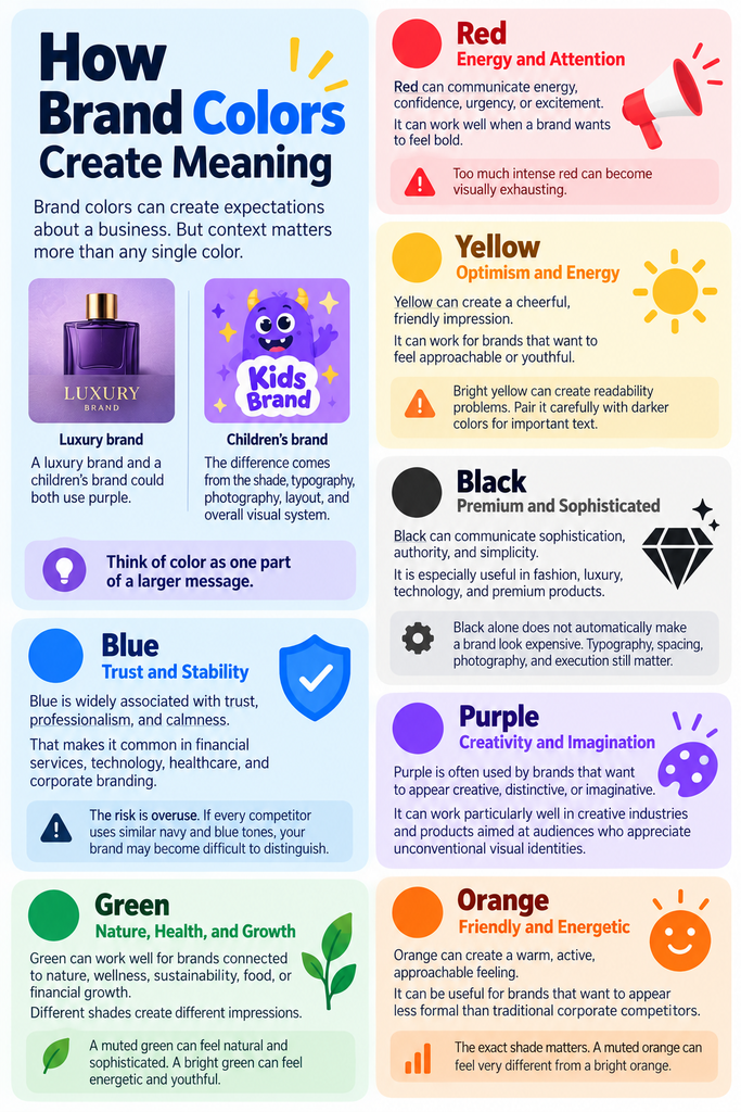
Brand colors can create expectations about a business. But context matters more than any single color.
A luxury brand and a children’s brand could both use purple. The difference comes from the shade, typography, photography, layout, and overall visual system.
Think of color as one part of a larger message.
Blue: Trust and Stability
Blue is widely associated with qualities such as trust, professionalism, and calmness.
That makes it common in financial services, technology, healthcare, and corporate branding.
The risk is overuse. If every competitor uses similar navy and blue tones, your brand may become difficult to distinguish.
Green: Nature, Health, and Growth
Green can work well for brands connected to nature, wellness, sustainability, food, or financial growth.
Different shades create different impressions.
A muted green can feel natural and sophisticated. A bright green can feel energetic and youthful.
Red: Energy and Attention
Red tends to create a stronger visual presence.
It can communicate energy, confidence, urgency, or excitement. It can work well when a brand wants to feel bold.
The downside is that too much intense red can become visually exhausting.
Yellow: Optimism and Energy
Yellow can create a cheerful, friendly impression.
It can work for brands that want to feel approachable or youthful.
However, bright yellow can create readability problems. Pair it carefully with darker colors for important text.
Black: Premium and Sophisticated
Black can communicate sophistication, authority, and simplicity.
It is especially useful in fashion, luxury, technology, and premium products.
But black alone does not automatically make a brand look expensive. Typography, spacing, photography, and execution still matter.
Purple: Creativity and Imagination
Purple is often used by brands that want to appear creative, distinctive, or imaginative.
It can work particularly well in creative industries and products aimed at audiences who appreciate unconventional visual identities.
Orange: Friendly and Energetic
Orange can create a warm, active, approachable feeling.
It can be useful for brands that want to appear less formal than traditional corporate competitors.
The exact shade matters. A muted orange can feel very different from a bright orange.
How Should You Choose Brand Colors?
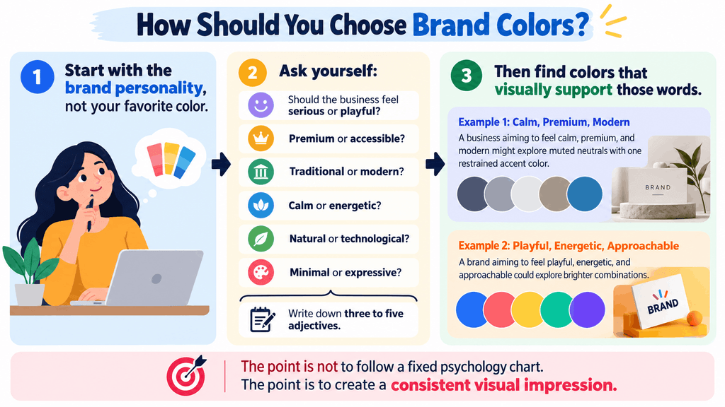
Start with the brand personality, not your favorite color.
Ask:
- Should the business feel serious or playful?
- Premium or accessible?
- Traditional or modern?
- Calm or energetic?
- Natural or technological?
- Minimal or expressive?
Write down three to five adjectives.
Then find colors that visually support those words.
For example, a business aiming to feel calm, premium, and modern might explore muted neutrals with one restrained accent color.
A brand aiming to feel playful, energetic, and approachable could explore brighter combinations.
The point is not to follow a fixed psychology chart. The point is to create a consistent visual impression.
Brand Colors Should Also Stand Apart From Competitors
A color can fit your personality and still be a poor choice.
Why?
Because customers do not see your brand in isolation.
They see it beside competitors on search results, social media, websites, packaging, and advertisements.
The Beginner Friction Factor: Choosing Colors in Isolation
A common beginner mistake is selecting colors from a palette generator without checking the competitive landscape.
The result may look attractive but blend into the category.
Create a simple competitor board instead.
Collect the logos, websites, packaging, or social profiles of five to ten competitors. Then identify their dominant colors.
Look for patterns.
If almost everyone uses dark blue, ask whether your brand needs to use the same approach.
You do not need to avoid the category color completely. But you should understand why you are using it.
How Many Brand Colors Do You Need?
Beginners often create palettes that are too large.
You usually need a small, repeatable system rather than ten unrelated colors.
A practical starting structure is:
- Primary color: The main recognizable brand color.
- Secondary color: Supports the primary color.
- Accent color: Used sparingly for emphasis.
- Neutral colors: Backgrounds, text, borders, and supporting elements.
This gives you enough flexibility without making every design decision from scratch.
Think About Where Each Color Will Be Used
A color that looks excellent in a logo may not work for body text.
Test your palette across:
- Website backgrounds
- Headings
- Buttons
- Social media graphics
- Presentations
- Packaging
- Business cards
- Mobile screens
Your brand colors need to work in real situations, not just inside a color palette generator.
Accessibility Matters More Than Aesthetics Alone
A beautiful palette can still create usability problems.
Text needs enough contrast against its background. Small text is especially difficult to read when the contrast is weak.
Do not rely on color alone to communicate meaning.
For example, a form should not indicate an error only through a red border. Use an additional message or visual indicator.
Before finalizing your palette, test contrast with a free accessibility checker.
This is one area where practical testing beats personal preference.
Courses and Resources for Learning Brand Color Strategy
You do not need a branding degree to learn the basics.
Start with free design resources and practical exercises. Paid courses make more sense when you want structured projects and feedback.
Brand Identity: Design Your Brand — Skillshare
Portfolio project: A foundational visual brand identity system.
Ideal student: Creative beginners who prefer short, practical visual lessons.
Why consider it: Skillshare is particularly useful for creative execution and visual workflows.
Honest limitation: Skillshare uses a subscription model. It makes more financial sense if you plan to complete several classes during the subscription period.
Brand Strategy and Brand Management — Coursera
Portfolio project: A broader brand strategy framework connecting identity with business positioning.
Ideal student: Beginners who want to understand why visual decisions should support business strategy.
Why consider it: Coursera is better suited to conceptual learning and structured brand strategy than quick visual tutorials.
Honest limitation: A strategy-focused course will not replace hands-on practice with color palettes and layouts.
Coursera and edX courses may offer free auditing for eligible courses. Payment is generally relevant when you need features such as a verified certificate.
Free Alternative: Build Your Own Color Study
Pick five brands you recognize.
For each one, record:
- Dominant color
- Secondary colors
- Neutral colors
- Target audience
- Brand personality
- How the colors differ from competitors
Then create three alternative palettes for one fictional business.
This exercise costs nothing and teaches you to make decisions rather than simply collect inspiration.
What to Learn After Choosing Brand Colors
Your next skill should be typography.
Colors rarely work alone. The typefaces you choose can completely change how the same palette feels.
Then learn:
- Basic layout and spacing
- Logo fundamentals
- Brand voice
- Social media design
- Brand guidelines
The goal is to build a system.
If every designer uses the same colors differently, the brand will still look inconsistent.
A simple brand guide should explain the approved colors, color codes, usage rules, typography, and examples.
Your Day-One Action Plan
You can create a useful first palette within an hour.
- Write three brand personality words.
Choose the feelings your business should communicate. - Research five competitors.
Record their dominant colors and identify obvious category patterns. - Create three palettes.
Give each palette a primary color, secondary color, accent, and neutral. Test them on a simple mockup.
Then ask someone unfamiliar with the project what each palette makes them expect.
That feedback can be more useful than asking, “Which color do you like?”
Your best brand colors are not necessarily your favorite colors. They are the colors that consistently support the position you want your business to occupy.